Extracting the full potential from data journalism in 2017
Key themes
• What does data journalism look like in 2017?
• Why is it important? How does it support the subscription business model for journalism?
• What do we need to have in place to do all of this?
• How do we know whether or not it’s working?
⭐ Bonus features: a deep-dive into Asia’s gender divide, and a behind the scenes look at the FT’s data-driven coverage of the 2017 UK general election ⭐
What does data journalism look like in 2017?
Data as an exclusive source
Cutting-edge data journalism increasingly relies on bespoke or technically complex datasets whose creation, curation or comprehension requires either specialist data gathering skills, specialist data analysis skills, or both
Taking data off diary
A good dataset is a trusted and authoritative source. You rarely quote your sources just because they happen to be in town: you go to them when their insights can be brought to bear on a wider story
Engaging, data-driven visual journalism
Leading news organisations are increasingly recognising the power of visual formats in communicating key facts and narratives quickly, effectively and memorably
Data as an exclusive source
This is increasingly where the value lies
More and more journalists of all descriptions are capable of locating and working with published datasets
// Spreadsheet journalism != data journalism
That should now be expected of any digital journalist. Writing stories based on the same numbers sitting in front of every reporter on your beat reduces your scope to provide unique value for your readers
Data as source
So...
The real value is to be found in developing your own datasets. Broadly speaking, this can be done in three ways:
• Creating a dataset from scratch
• Collecting or curating datasets to create something worth more than the sum of its parts
• Working with data in extraordinary formats or volumes
Creating a dataset
Case study 1: Washington Post | A visual history of Donald Trump dominating the news cycle
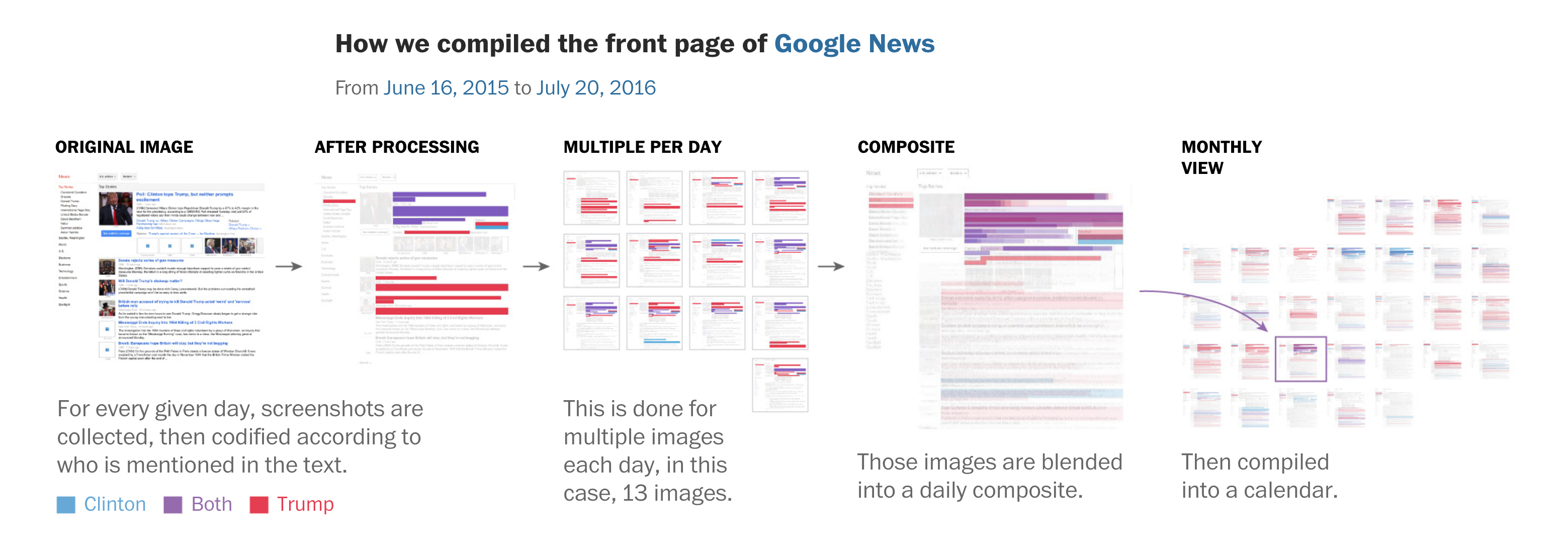
Creating a dataset
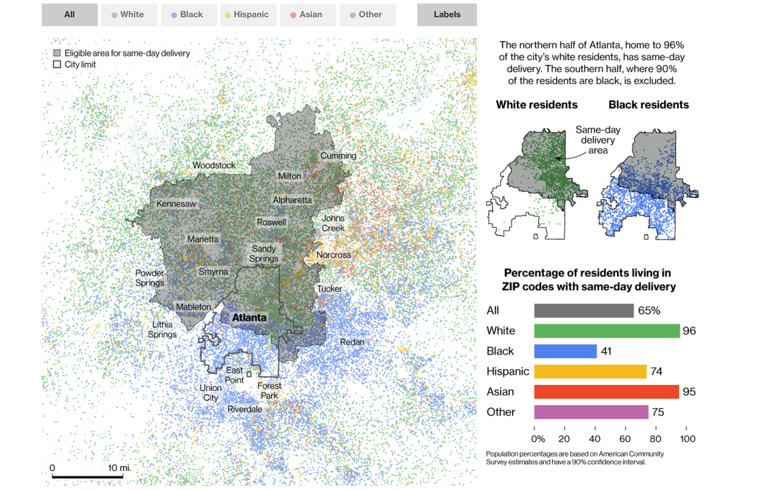
Case study 2: Bloomberg | Amazon Doesn’t Consider the Race of Its Customers. Should It?
Combining datasets
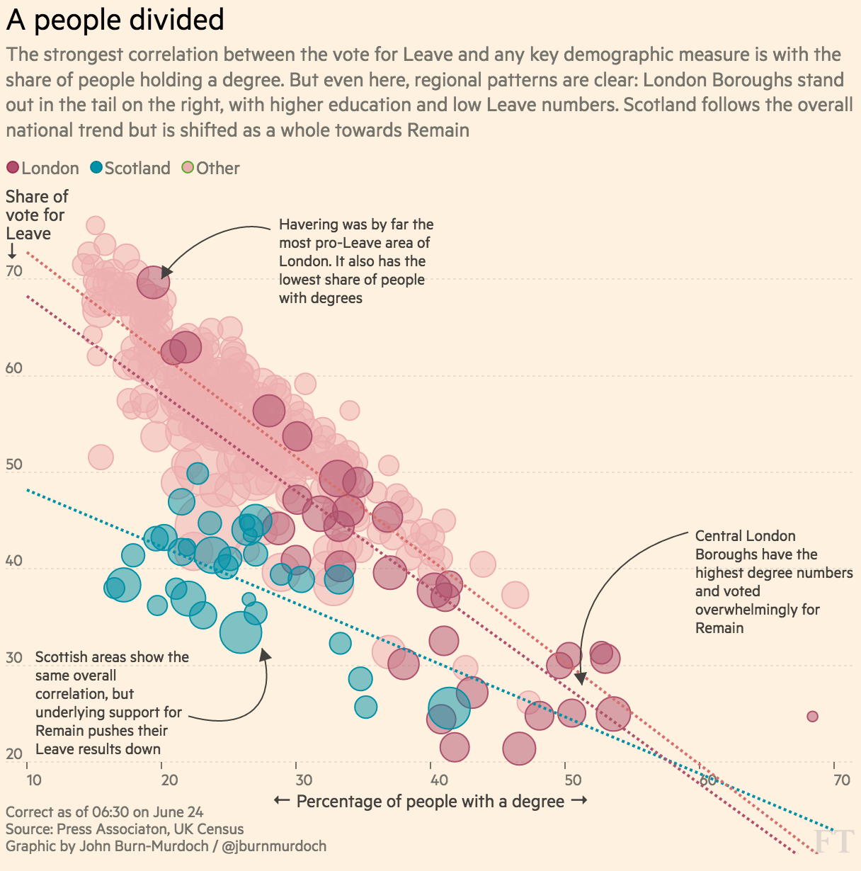
Case study 1: FT | The demographics that drove Brexit
Combining datasets
Case study 2: Reuters | Le Pen thrives among French poor, vote analysis shows

Taking data off diary
All of the data used in these post-election analyses was in the open for months or years, but the value comes from knowing where to find it and how to interpret it when the moment comes
Combining datasets
Case study 3: FiveThirtyEight | Trump Was Stronger Where The Economy Is Weaker
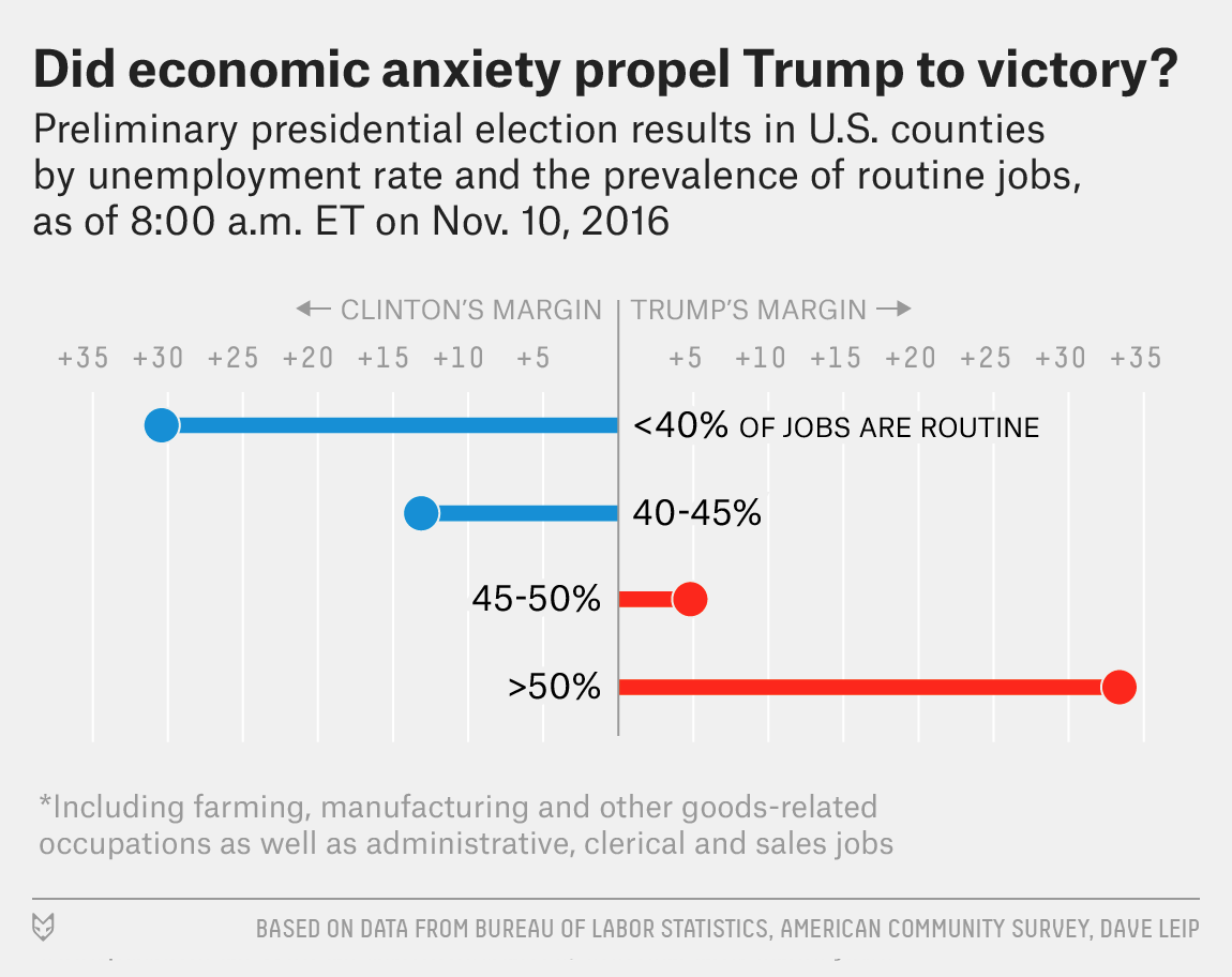
Combining datasets
“Social science done on deadline” — Steve Doig
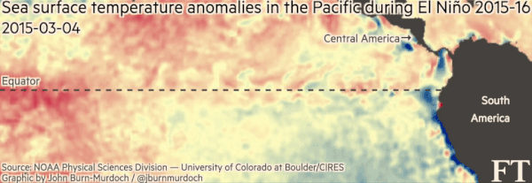
Non-standard data formats
Case study: FT | What is El Niño and how does it affect global crop yields?
How does this support the subscription business model for journalism?
The New York Times recently published a fantastic, detailed report
Among the highlights were:
• The success of its digital subscription model...
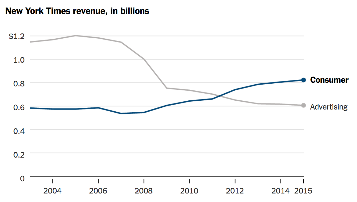
The New York Times recently published a fantastic, detailed report
• The importance of visual elements to its future...
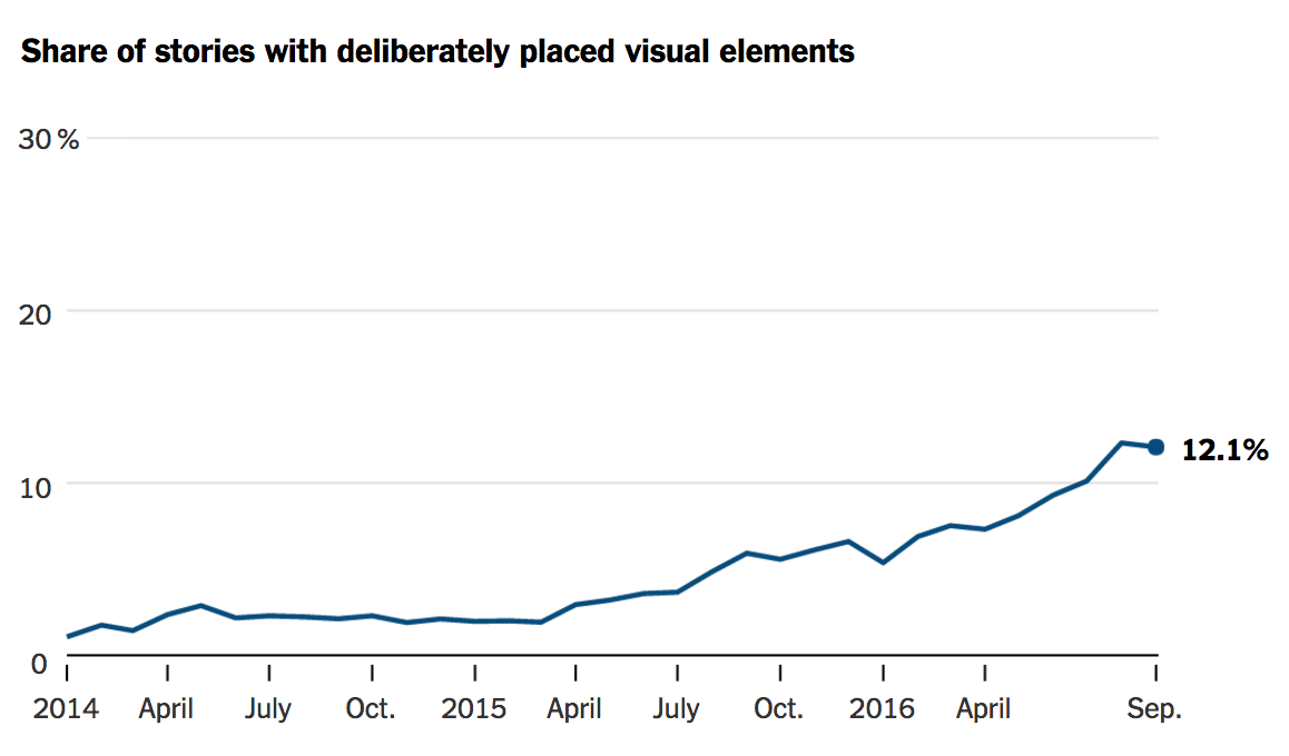
The New York Times recently published a fantastic, detailed report
• The need to spend less time on low-value-added news, more on unique journalism...
The New York Times recently published a fantastic, detailed report
• ...and the need to be smarter and more strict about efficient use of editorial resources
So where do data and graphics come in?
Generating unique value
The products of cutting-edge data journalism are typically deep, detailed analyses and visualisations, as well as quicker pieces in cases where the quality of the visual presentation or the exclusivity of the underlying data generate unique value
Generating unique value
• They’re a great vehicle for differentiation through value-added journalism, and for brand-establishment/consolidation
• When used intelligently, they set you apart from your competitors and minimise the risk of being seen as “just doing what everyone else is doing”
Generating unique value
• Readers will come to see them as a core part of your premium product
Creating efficiencies
Data-driven journalism: Using scripts, tools, APIs to automate part of the process of routine journalism, thus freeing-up reporters’ time to spend on deeper, more complex, more fundamental stories and analysis
Creating efficiencies

Creating efficiencies
Graphics: A showpiece graphic whose visual strength and depth will attract, hold and reward readers’ attention might once have required several week’s work. Now the same impact can be achieved by one person in a day or two
The Dow Jones: a flawed measure but with a rich history, making it an ideal candidate for a very tall chart https://t.co/kcjttN50D3 pic.twitter.com/a9WODEvxnZ
— Alan Smith (@theboysmithy) January 16, 2017
Increasing engagement
Graphics and stats are inherently optimised for social
• “A picture speaks a thousand words”
• People love being able to share something which proves a point, debunks a myth etc. Stats and graphics lend themselves perfectly to this
Regions with the biggest votes for Leave are also the most economically dependent on the EU https://t.co/vL2D3SkEIP pic.twitter.com/gUjDX64OY3
— Financial Times (@FT) June 24, 2016
Increasing engagement
• Social media streams are growing busier and busier. Clear, crisp graphics will stand out in those feeds, and if they tell a clear story or impart a message that taps into people’s emotions, they’ll fly
The collapse of the French Socialist Party in one image pic.twitter.com/J99m2kdpA2
— Marcel Dirsus (@marceldirsus) April 24, 2017
So what do newsrooms need to put in place to do all of this?
Where do we start?
• Quantitative methods: in statistical analysts, predictive modellers and "creative data collectors"
• Data visualisation: specialist in rich, non-standard graphics across static, interactive and animated forms
• Subject knowledge: collaborating with specialists elsewhere in the newsroom is ideal for deeper pieces, but for quicker hits — and best results all around — encourage technical specialists to pursue interests in core areas of the news agenda
Where do we start?
Technical specialists should have time built into their schedules to allow for expansion and or honing of their skill-sets
Where do we start?
Use graphics to tell stories. Every news organisation could substantially improve the quality of its visual output without making any more charts. Lose the boring ones. Lose those which are simply accompaniments to self-sufficient work. Lose the ones used purely “to break up the text”. Never commission a graphic because "it’s an important story, so it needs a graphic”
Where do we start?
See also: Brian Boyer’s Six Commandments of Data Visualisation (via Martin Stabe)

Where do we start?
Give your visual journalists editorial and creative agency. They and you will benefit enormously. The made-to-order bar chart is no better than the 400 word story that all of your competitors — and 50 other websites — has. It’s a low-value use of a high-value skillset, it does nothing to strengthen your journalism or your brand, and it can be demoralising for those involved
How do we know whether or not it’s working?
How do we know whether or not it’s working?
Signs of success include:
• Direct, verbal reader recognition of the added value provided by this work
• New subscriptions from — or first-time visitors to — these pieces of content
• High reach and engagement on social media
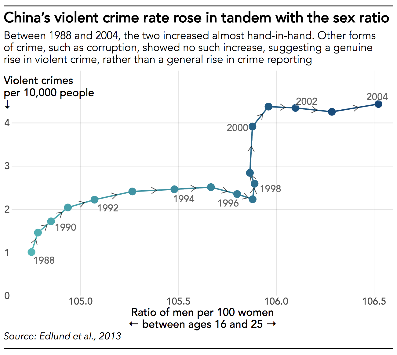
Too Many Men
A deep-dive into Asia’s gender divide
Asia has millions more men than women
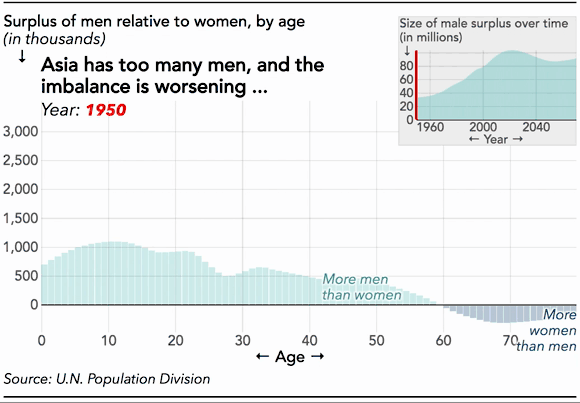
Why?
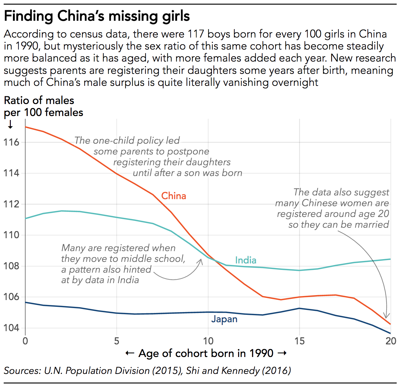
Abortions, infanticide, lethal neglect?
Why would that lead to more men?
And what would drive the son preference?
What might the impacts be?
Abortions, infanticide and lethal neglect
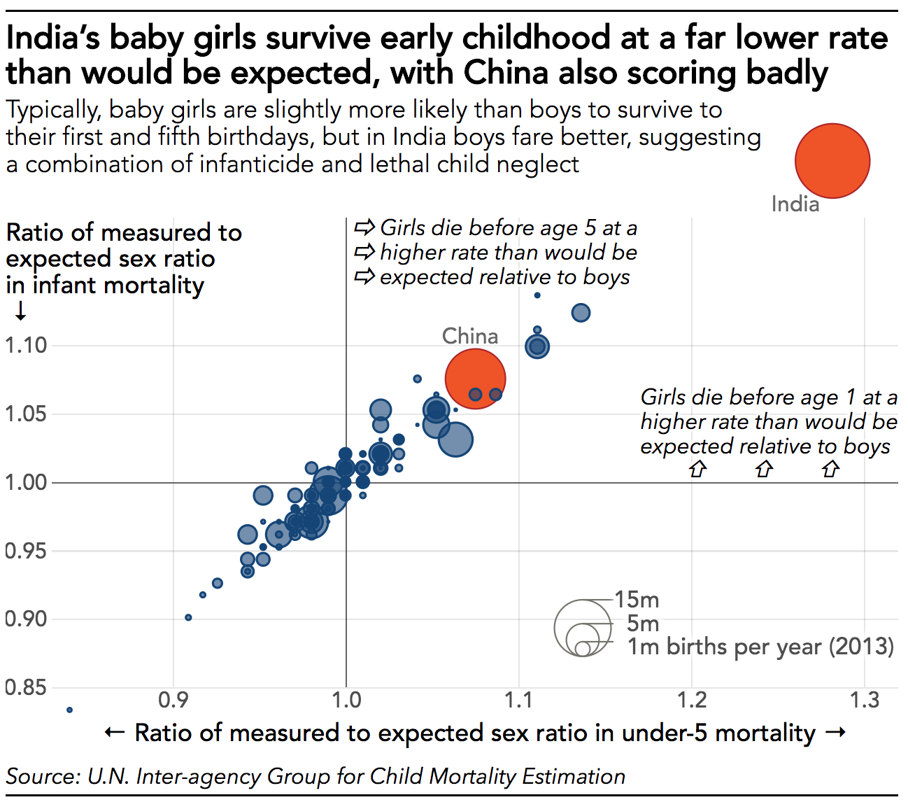
On the other hand...
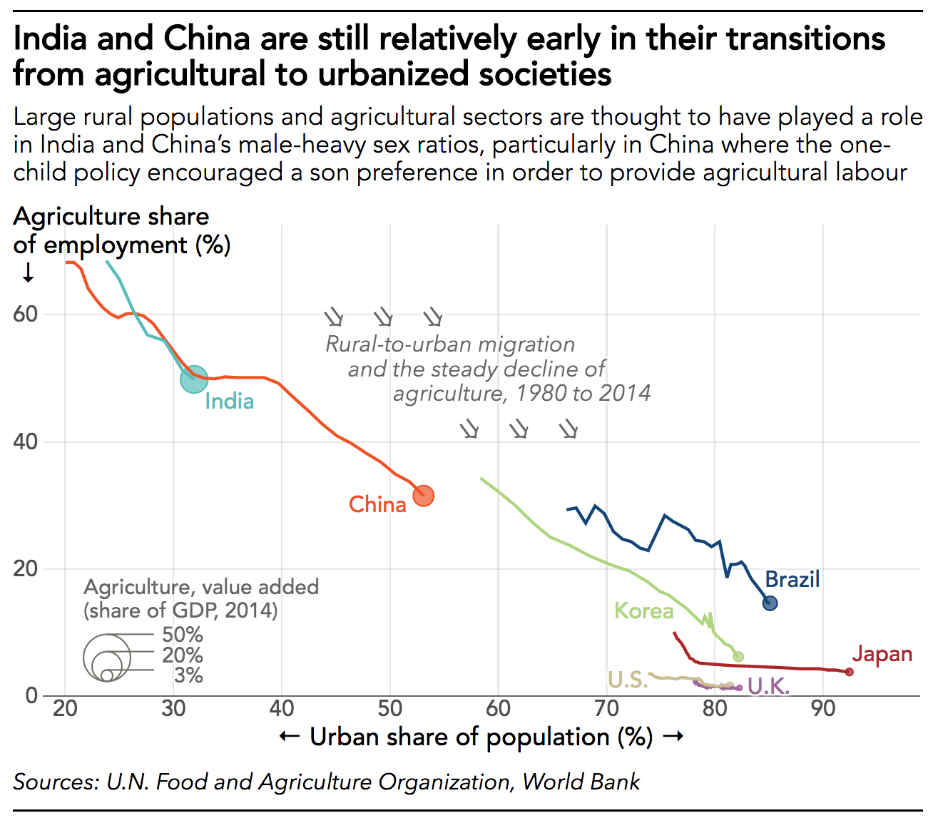
What would drive the son preference?
A still-dominant agricultural sector, and accompanying attitudes to physical labour
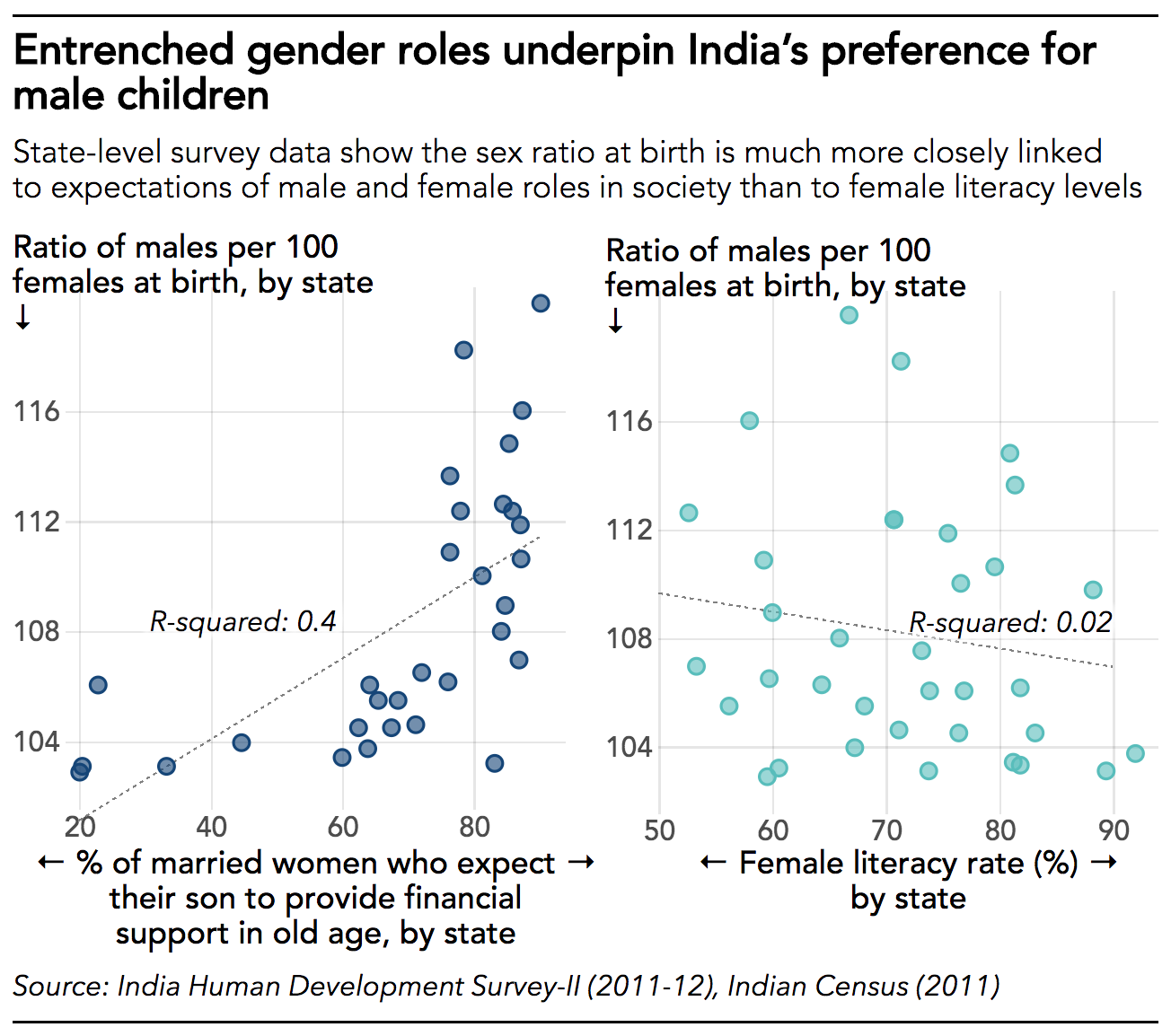
What would drive the son preference?
Entrenched gender roles in society
What happens next?
A sneak peak at the FT’s data-driven coverage of the upcoming general election
>>Useful resources
• The R statistical programming language
• The pandas data analysis library for Python
• Jeremy Singer-Vine’s newsletter, Data is Plural
• The d3.js data-visualisation library
• NYT Upshot, FiveThirtyEight, The Economist Graphic Detail, FT Visual Journalism, FT Baseline
Any questions?
You can reach me on Twitter @jburnmurdoch or by email at john.burn-murdoch@ft.com
These slides are at bit.ly/ddj-manifesto